Toning has the ability to completely change a photograph.
I used to selenium tone all my gelatin-silver black and white prints. I could never really tell the difference, it's just what a lot of photographers did. I always struggled with toning, and found it difficult to tell what color the print picked up unless it was held against a neutral image or another toned image. In a wet darkroom, toning also added another step, another tray and another chemical. I finally ended up using the different photo papers that were available to get the right tone in my black and white prints.
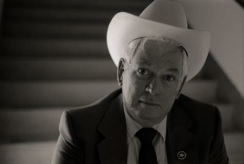
Glenn Krueger, Texas Ranger, San Antonio, Texas
If I wanted a neutral black and white paper, I bought Agfa Brovira, Oriental Seagull or Kodak Elite. For warm-toned printing, Agfa Portriga Rapid was the hands-down winner. Having a variety of papers on hand got expensive, so many photographers stuck with one paper for all their work. I remember paying about $48 for a 100 sheet box of 8x10 paper. I preferred contrast graded papers like Seagull and Brovira so printing effectively and efficiently meant you had to have various grades on hand in different sizes.
Digital technology has changed all that, in good ways and bad. Toning an image, or making other modifications, is now a matter of clicking a button or making a menu selection. Computer monitors can be more forgiving than prints so the result has generated images that, in my opinion, are grossly over-processed. Photographers aren't thinking of what they want from an image or project and simply try to create something that looks cool with little thought to the end result. My pet peeve is the portraits and head shots that are Photoshopped to make the skin look like porcelain. No one has skin that perfect! As with paper, just think about what you're doing, what you want for your end result and then experiment.
In the picture of Ranger Krueger I used a light warm sepia tone preset that introduces just enough warmth to color the B&W photograph and soften the overall look, or tone, of the print. I'm much happier with the warm toned prints than with the selenium toned gelatin silver prints I have of the same subjects. The warm tone just works better with the individual portraits and fits better with the overall theme of the project. I also like the color it gives the white highlights, they just look creamy rather than snow white.
I do have to give thanks and credit for the presets, which I accessed through a Flickr group called Presetting Lightroom assembled by Markus Griebling. The presets I downloaded were developed by Glenn E. Mitchell II, Ph.D. and I downloaded them through the Flickr link to Dr. Mitchell's profile or you can also go directly to his blog and website called The Light's Right.
1 comment:
Tony, thanks very much for mentioning the Flickr group in your post. I'm certainly glad that you found our group on Flickr and that the Presetting Lightroom presets list was of some benefit.
Cheers, Markus
Post a Comment